Archive for 九月 2007
Week 4: Accessible HTML/XHTML Forms
Last week, I have read a web site shown Accessible HTML/XHTML Forms . This web site demonstrates ideas and techniques that apply to Web designers and developers of every experience level.
Ideas: The Basic of Layout on HTML
1.Bad Practices
Consider a long series of checkboxes. If you had it the other way around, it would be rendered like this:
Please call me at home
Please call me at my workplace
Please call me at the shack
2. Good Practices
Follow this advice and your forms will automatically become more accessible because this is how devices expect them to be set out.
| HTML Element and type | Order of Appearance | Example |
|---|---|---|
| input type="text" | Descriptive label, HTML element | Your First Name |
| input type="password" | Descriptive label, HTML element | Your Password |
| input type="button" | Not applicable (value attribute used instead) | |
| input type="submit" | Not applicable (value attribute used instead) | |
| input type="radio" | HTML element, Descriptive label | Yes, I am married
|
| input type="checkbox" | HTML element, Descriptive label | Subscribe to the newsletter |
| select | Descriptive label, HTML element |
|
| textarea | Descriptive label, HTML element | Your comments |
| button | Not applicable (value attribute used instead) | |
Ideas: Don’t assume scripting is enabled
A form should be usable regardless of whether scripting is enabled within a browser (if it even supports scripting – remember, some devices do not support scripts at all). So please make sure that your forms works fine when the scripts are not allowed.
Ideas: Avoid JavaScript for Navigation
1. Bad Practices: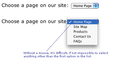
2. Good Practices:
Ideas: Use Label to make input obviously
| Form element looks like | Coded like: |
|---|---|
| |
 |
| Age: |
 |
| What colours do you like: |
 |
| |
 |
| |
 |
Ideas: Use of Fieldset on XHTML to let users clear
If you are presented with a list of 50 seemingly unrelated checkboxes to tick in a survey it’s very daunting. I wouldn’t bother – would you? But there is a saying ‘Divide and Conquer’, and it has a friend in the XHTML entity.
Using fieldset you chunk up your 50 questions into, say, 5 clearly identifiable groups of topics, each with 10 properties/attributes. You increase the usability/accessibility by making the page clearer to the sighted user, or the user who may have cognitive difficulties.

Week 3: Criteria for optimal web design (designing for usability)
In the first week, I have read an article named Criteria for optimal web design (designing for usability)
The web site first shows some questions to address important human factors concerns in the design and building of usable websites. The questions are below:
- How should information be positioned in a typical website?
- What is the best way to arrange menus?
- How can I make my website’s structure more navigable?
- How should text be presented within a website?
- How can I effectively use images on my website?
- Are frames ever appropriate?
- How can I design a visually pleasing interface that follows usability principles?
- How can I reduce the major user annoyances on my site?
- How can I make my site more accessible to children?
- How can I make my site more accessible to older adults?
- How can I make sure my site follows general Web conventions?
- How can my website promote customer sales and loyalty?
- How can I make my site more appealing to international users?
I would use the first question to further explain the design of websites. It describes a study found that a website is in higher usability when the text inside is 1) written concisely 2) easily scannable and 3) written in objective. That means it suggests the text should be:
- Very CLEAR and SHORT
- Include only ONE key concept per paragraph
- Use highlighted keyword or phrases
- Use bulleted lists when possible
The below example shows all the recommendations:
Users have grown accustomed to looking in certain areas on a screen to find specific items (Bernard, 2001). Analyzing users’ expectations of where they expect specific web objects to be located revealed that generally,
- Internal web links were expected to be located on the upper left side of the browser window (Figure 1).
- External web links were expected to be located on the right side or lower left side of the browser window (Figure 2).
- The “back to home" link was expected to be located at the top-left corner and the bottom-center of the browser window (Figure 3).
- The internal search engine was expected to be located at the top-center of the screen (Figure 4), and
- Advertisement banners were expected to be located at the top of the browser window (Figure 5).
- The login/register button was expected to be located at the upper-left corner of a web page (Figure 6).
- The shopping cart (basket) was expected to be located at the top-right corner of a web page (Figure 7).
- The help button was expected to be located at the upper-right side (Figure 8).
- Links to specific merchandise items were expected to be located at the left upper-center of a web page (Figure 9), and
- The account/order button was expected to be located at the upper-right of a web page (Figure 10).


Week 2: How to Make Your Web Site Sing for You
In the first week, I have read an article named How to Make Your Web Site Sing for You.
This article explains the importance of a well-developed website and briefly describe how to turn the bad web design into good web design.
A web site is not just a description of your company, giving information to every visitors. It is also a digital business card. The outlook and usability of your web site could even enhance your company’s reputation or image when a customer gets into your home page.
In the article, it gave us important facts “Only 50 percent of Web visitors scroll down the screen to see what lies below the visible part on their PC monitor," and “Users spend 30 seconds reviewing a home page." It revealed that the design of the first page is the most significant elements among your whole web site.
The recommendation from this web site:
1. Dont use difficult wordings which are not understood by public.
2. Only 50 percent visitors would scroll down the screen, so show all important info on front screen.
3. Do not ask potential clients to fill out a form simply to ask a question.
4. The site should contain physical address, include a photograph of the building.
5. A business must encapsulate what they do in very few words.
6. Your Web site is like a digital business card.


